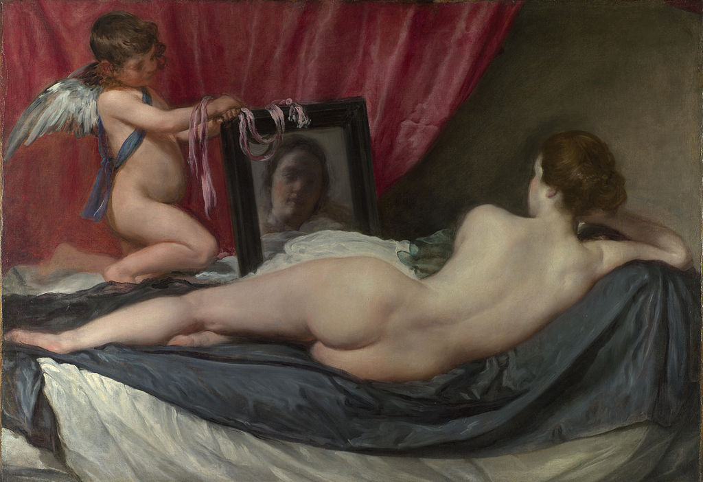
Sometime a work of art becomes implanted in our mind because we find it disturbing. Not that we do not acknowledge its greatness, the artistic grandeur and the stylish finesse, but there is something about it that touches us in an unpleasant way, evoking discomfort, perhaps even anxiety. When I first saw the Rokeby Venus (known as ‘The Rokeby Venus’ since it was part of an art collection in Rokeby Park) I felt some agitation, and simply couldn’t figure out where it was coming from. Venus, as we all know, is the embodiment of love and beauty, and is often depicted in works of art. But the Rokeby Venus, a huge picture covering an entire wall at the National Gallery, created a strange turmoil.
The Spanish painter Diego Velázquez (1599-1660) painted the female nude in spite of the vehement opposition of the Spanish Inquisition. He created this painting between 1647 and 1651, and was determined to depict the female body in the most realistic and vibrant manner. In a way, this picture is an attempt to address human sexuality – not in a vulgar way, but through a portrayal of the most exquisite female ideal. Venus, the Roman goddess of love, beauty and fertility, is recumbent on a couch, watching a mirror – two gestures typical of her depiction in art – as Cupid, her son and the god of physical love, holds the mirror in front of her. Though she appears to be gazing at herself at the mirror, her eyes reveal that she is, in fact, watching the viewer.
Art historians often argue that the distinct nature of the picture derives from its simplicity – it has no embellishments and hardly any decorations. Both Venus and Cupid are portrayed very realistically, a woman and a young boy on a couch.
I tend to disagree with this argument. Indeed, there are no jewels and accessories, yet the embellishment—almost adoration—of the female body is embedded in the exposition itself: Venus’s naked body is set on a black sheet placed over a white one. The black sheet, as is often noted, follows her body contours. The couch almost evokes an association of a shrine. It seems to me that Velázquez went out of his way to illustrate the beauty of the female body.
So why did I find the picture so unsettling? After many deliberations I came to the conclusion that it includes two distinct perspectives: one feminine and the other masculine. They co-exist, creating an inner tension, which makes the viewers stare relentlessly at the painting.
From a masculine perspective, Venus’s beauty is overwhelming. The delicate contours, the rosy undertones, the pale back, the light neck and temple, suggesting purity in spite of her sensual posture, the naked body contrasted with the black sheet – an ode to feminine perfection. This Venus is the embodiment of sublime seduction.
Yet, examining the picture from a feminine outlook is an altogether different experience. First, there is the mirror. Venus seems unable to look at her body; she is gazing only on her face. Why isn’t her entire figure reflected in the mirror, but only the facial features? To me, it is nearly a feminist declaration: women find it hard to watch their naked body. Endless hours spent in front of the mirror are always about: do the clothes flatter me? Is the makeup right? Can my flaws be seen through the dress? Velázquez is depicting feminine estrangement from simple, straightforward female nudity. Men adore Venus’s naked body, but she is unable to look at it herself.
To emphasize her inability to look at herself, even when she watches her face in the mirror, she appears to see nothing but a blurred image, with uneven colors. And a close examination of her gaze, which should have been directed forwards, reveals that it is traveling to the viewer. In essence, it is a portrayal of a beautiful woman who is unable to look at her body and face and see its allure.
And also, her beautiful body is placed on the black sheet as if it were an object. We don’t really see her facial expression, thus her emotions remain concealed. If we ignore for a moment that it is Venus, and imagine, for the sake of the argument, that this picture was created in the 21st century, we would probably perceive it as chauvinistic.
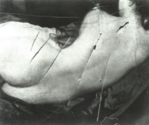
So which perspective should we adopt? The feminine or the masculine? They are both there, within the picture, evoking two contrasting sets of emotions. Most viewers look at it bewildered, admiringly yet with some unease. In 1914 an English suffragette slashed the picture with a knife, badly damaging it.
Velázquez was, I believe, a man ahead of his time. His intricate, complex drawing of female nudity, in spite of the Inquisition’s threats, reveals a desire to address the psychological aspects of female and masculine sexuality, to outline the difference between them. The hazy face in the mirror, with the eyes secretly watching the observer, may well have been one of the earliest manifestations of modern feminism.


Thanks!
I LUV this
your analysis, essays on art have been useful to begin to look at art again, from my new perspective, as i have been looking at the world from a different perspective since 2011. taking each thing at a time, looking at modern music and entertainment, religion and all the things of life. i’m working out my understandings and am always open, in my mind, since i desire to learn in order to uplift and help move us all into something brighter. then i was analyzing in this image, slightly disappointed at being relegated to the smaller, limiting view but realizing the blessing it is to see it at all. then at the end of my own thoughts on the image here i had realized that… when you try to pull the red curtain aside, to see what is being hidden, what do you see??? a wall! a wall blocking our ability to see out and perhaps from allowing someone to see in as well.
test